The NHL is unfortunately not at all hesitant to throw away partial or entire seasons. It's too easy to imagine a future where the NHL has become something more like the World Cup, showing up once every four years or so.
Perhaps that's a bit too much hyperbole, but the case is that we are not lacking in reduced or postponed seasons in the last 20 years. In fact, since 1992 there have been four labor disputes that have caused disruption of the season:
1992 Strike: 30 games postponed
1994-95 Lockout: Partial cancellation of season and shortening of schedule
2004-05 Lockout: Full cancellation of entire season
2012 Lockout: Pre-season canceled. Currently no plans to begin season
Now, I apologize in advance this week if things are a bit more on the side of descriptive statistics, but what we have here are only a handful of data points. My question is: can we notice anything in NHL trends that appears to be a consequence of these labor disputes?
For today more specifically, do fans care? Perhaps even more than that, do they care enough to change their actual behavior?
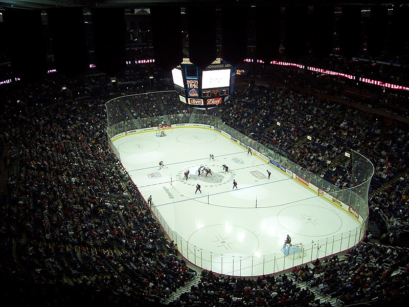
The most readily available data that seems to be archived on fan behavior is game attendance. While I was only able to find it back to 1993 that's a lot better than any other statistics I tried to find. Unfortunately this means that we can't tell a whole lot about the 1992 lockout. What we can gain from the '94 dispute is also likely limited due to the lack of trend leading up to that season. Our biggest bet then is looking at the impact of the '04 season - we have a decent amount of data leading up to it as well as a few years now after the fact. It's also the largest of these events, as it was the only situation where the entire season was scrapped.
I hope you like graphs.
The two ways I first thought of looking at this are actually opposite extremes. The first is over all teams:


The first graph is looking at the average attendance, per game, over all teams. The second is still average attendance per game, just aggregated to team instead of league.
Now, with 30 teams the aggregation to league washes out a lot of the variance. That would be good if this variance was simply noise, but bad if it was the something we were interested in. Truth be told I'm not sure if we're going to be able to make that distinction today, so I think it's worth looking at the noisier picture with the caveat that we should be a bit more skeptical about anything we 'find' in the data.
Let's be honest - 30 teams on the same graph is just a mess. Luckily, someone at the NHL has a penchant for symmetry, and there are two equally sized conferences, each with three equal size divisions. Awesome.
Well, let's start big picture and work our way into it, shall we? Here's what things look like if we break down the overall graph into the Eastern and Western conferences:

It looks as though the Eastern Conference had been slightly trailing the Western Conference leading up to the 2004 season, but by the time things restarted in 2005 they were pretty much caught up. Again, this looks like a very small difference, and I'm hesitant to make too much of it at the conference level. If there's anything to take away from this graph it might be that the slow rise in attendance that we see in the overall graph is being driven more by the Eastern Conference than the Western Conference, but it's not a huge effect.
Let's look at how things work out at the Division level.

Well, this is better than that graph with every team, but now we're getting into the level of aggregation where we're likely to see a lot of noise. There are a number of things going on here, but it looks like Western Central is the only division that took a hit coming off of the 2004 lockout, but had recovered by 2008.
If there's something big here, I'm still not really seeing it at this level. Remember how I said I hope you like graphs? Here we go:


Those flat lines you see in some graphs are also not errors of the data, but ceiling effects. They represent situations where the stadium might be getting a little small - the average attendance is all about the same because they're close to or actually selling out every home game of the season. Montreal and Calgary stand out as teams who came back from the 2004 lockout only to sell out their stadiums every year following. Calgary, especially, took a decent jump from 2003 to 2005.
On the flip side of post-lockout sellouts is a team like Detroit that had a pretty good pre-lockout sellout trend going, only to return in 2005 to slightly weakening numbers.
So, how much of that is related to the lockout, and how much is noise? Montreal and Calgary are pretty big hockey towns (the NHL was founded in Montreal, and the Canadiens hold the record for most championships at 25), and Chicago 2005 to 2009 was building a great team that would win the Stanley Cup at the end of the 2009-10 season. The Detroit team that headed into the lockout had just won 3 of the last 8 Stanley Cups, and post-lockout has been fielding a good but aging team that isn't the same juggernaut of those years (even though they've still won yet another Stanley Cup).
Is it possible that all the trends in these graphs can be explained away with similar facts? Certainly not. That said, it does seem that the largest effects might be able to be explained away with simple facts about the teams and their records. Based on attendance it doesn't seem like the 2004 lockout hurt the NHL (aside from having vacant arenas for a year), and if anything it made more people show up the years following.
Whether that happens next year is hard to say, as so much of this year is still up in the air. It's possible play will start sometime soon, but it's also possible we'll have a repeat of 2004. Even with a repeat of 2004 it's hard to say that fans would act anything like they did in 2005, as that was the first full lockout and this would be the second. Fool me once, etc. Dealing with such rare instances makes for tricky prediction.
Unfortunately for the impatient among us, the best way to figure out what a 2012-13 lockout would do to NHL attendance would really just be to have the full lockout and wait for the 2013 season. Hopefully that doesn't happen.
What's the rank order stability look like for attendance (i.e., what is the average lag-1 correlation for teams)? That's a simple stat that would quantify how much movement you are seeing in the 30-team graph. You can also calculate the 20-year stability coef. (correlation of attendance at 1992 with attendance in 2011 or 12).
ReplyDelete